New General Motors Logo Geared Toward Electrification
For the first time in a decade, General Motors has revamped its logo. And people aren’t loving it.
With its move towards electrification, the automaker decided it was time to make a change. And what better time than with the start of an ad campaign promoting its commitment to EVs. GM is hoping to have 30 electric vehicles on the market by 2025.
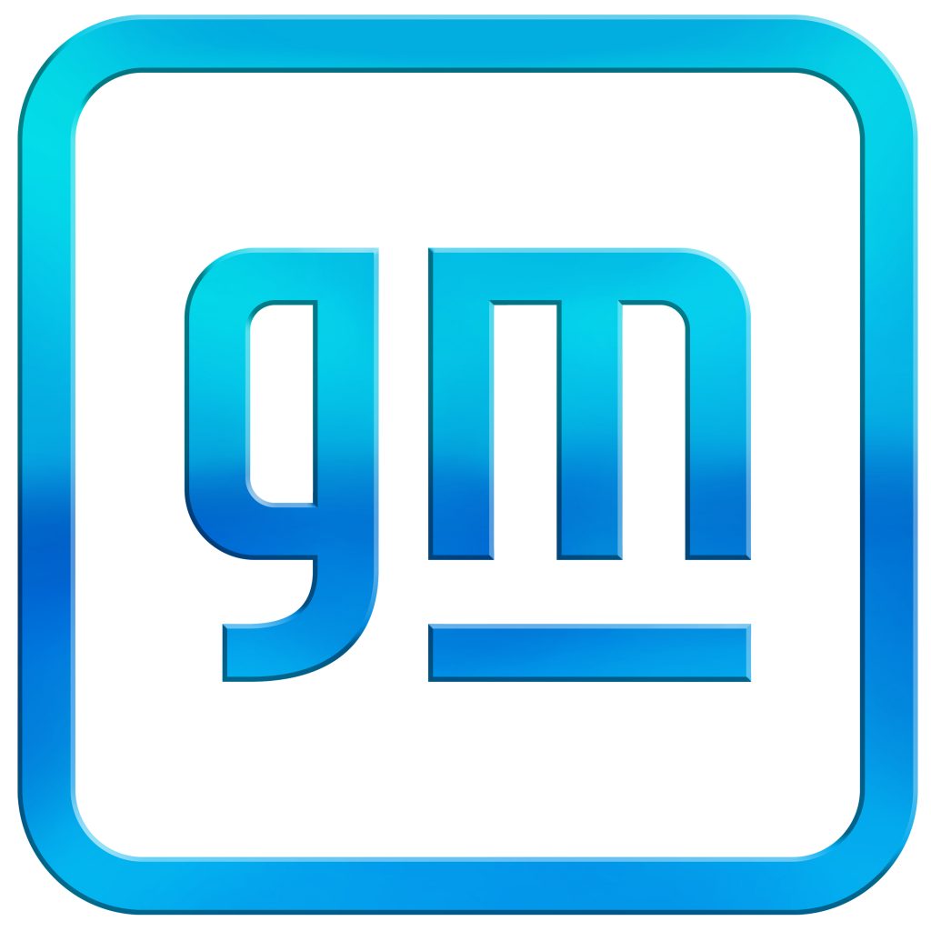
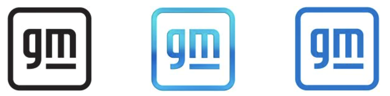
The logo remained blue but switched to a lighter, brighter shade and includes a new font in lowercase lettering that GM says embodies “the clean skies of a zero-emissions future and the energy of the Ultium [battery] platform”.
GM released three different variations of the new logo, one in black, one in the traditional GM blue, and the final in a new shade of blue. The new logo was created by GM’s own designers and the font was created in-house.
“Unlike ever before, we have the solutions, capability, technology and scale to put everyone in an EV,” Deborah Wahl, head of marketing at GM, said in a statement. “Our new brand identity and campaign are designed to reflect this.”
Along with the Chevrolet Bolt EV, new electric vehicles GM include the Cadillac Lyriq and GMC Hummer EV which will go on sale later this year.
Want to read more articles like this?
Join the PowerNation Email NewsletterRead More from PowerNation